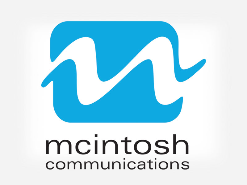
A provider of everything from email marketing to training solutions, the concept we implemented for McIntosh Communications suggested consistent waves and fluidity. Additionally, we loved the idea of using the shape of the initial "m" of McIntosh to create the wave form as it related to the niche market of podcasts and radio.
Once the logo was a vision of loveliness,
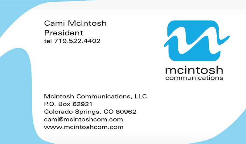
we applied it to the stationery.
The subtle repetition of the logo was used as a border for the business card design. To aid in brand recognition, we reinforced part of the "m" wave shape in the mark by using it as a subtle background graphic and border.