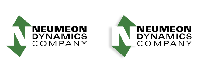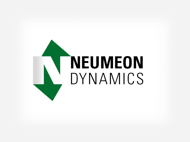
Neumeon Dynamics is a wind energy component and resource developer. Research showed that a turbine was an overused motif for this type of company, so we opted to use the letter "N" and a more subtle suggestion of circulation using arrows.
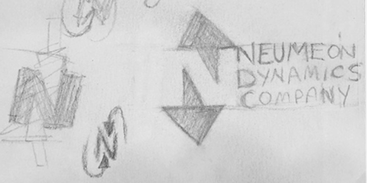
We're often asked about our exceptional creative process. Sometimes inspiration comes at odd times. The back of an envelope was available when inspiration hit. The negative space in the initial "N" became arrows.
During the design process, numerous options were discussed and modified. Whether or not the letter "N" was visible, and whether to use "Company" as part of the logotype. Colors and fonts were tweaked based on the preferences of the client.